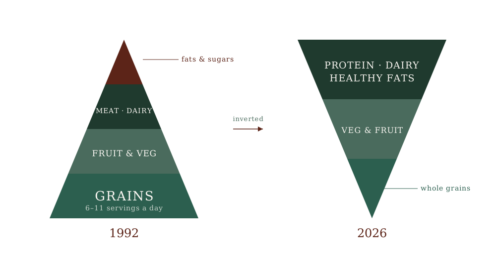
In January 2026 the United States government brought back the most recognisable diagram in the history of public nutrition — and turned it upside down. For a generation, official dietary advice rested on a broad base of grains: the 1992 food pyramid put six to eleven daily servings of bread, rice, cereal and pasta at the bottom, and even after the pyramid gave way to other icons the grain-heavy base remained the message. The new version, unveiled by the Department of Health and Human Services and the Department of Agriculture, rests those same grains on a narrow tip and puts protein, dairy and fats where the bread used to be. Before asking which version is correct, it is worth asking the more revealing question: if a diagram can be inverted in a single announcement, what was it ever made of?
This essay is not a defence of the old pyramid, and it is not a celebration of the new one. It is an argument about what a national food diagram is in the first place. The claim is narrow, and I think hard to argue with once the history is on the table: a population-level food guide — the 1992 pyramid and the 2026 inversion alike — is a political instrument before it is a clinical one. It is negotiated, not simply discovered. Understanding that changes what a reasonable person does with it. What it does not do is license the reflex now circulating — that because the old guideline was shaped by interests, you should now eat the opposite of whatever it used to say. That is not where the analysis leads. It leads somewhere more useful, and less satisfying to either side of the argument: no single diagram, however drawn and by whoever’s hand, was ever going to be a prescription for the individual person reading it.
The paper trail
The strongest version of the “it was never just science” claim is not mine. It belongs to Marion Nestle, who was for years the chair of the department of nutrition at New York University and who served on the federal Dietary Guidelines Advisory Committee for 1995. She is not a critic throwing rocks from outside the building; she was inside it. She documented the food lobby’s influence on the pyramid in a peer-reviewed paper in 1993, and set the whole account down at book length in Food Politics: How the Food Industry Influences Nutrition and Health in 2002. This is the same category of source as Marcia Angell on the pharmaceutical industry, or John Ioannidis on the reliability of published research — an establishment insider describing, with citations, how the machinery of their own field actually runs. It is not a conspiracy account. It is a paper trail.
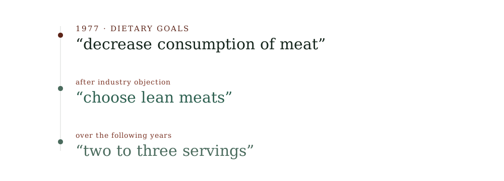
The paper trail runs like this. In 1991 the Department of Agriculture prepared to release a food guide called the Eating Right Pyramid. Before it could be published, it was withdrawn — under pressure from the meat and dairy producers whose products the diagram positioned near the “eat less” apex. A year later, in 1992, the pyramid was released again, substantially the same design, after a round of revision and additional research that arrived at more or less the place it had started. The earlier history is the same story told once more. When the McGovern committee’s Dietary Goals for the United States first appeared in 1977, it told Americans plainly to “decrease consumption of meat.” After the affected industries objected, the language in the revised edition softened to a recommendation to choose lean meats. The advice to eat less of a thing became advice to eat a better version of the same thing. Over the following years the guidance on meat drifted further, from “decrease” toward “two to three servings.”
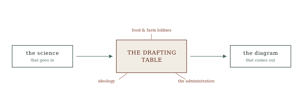
Notice what is and is not being claimed here. No one is saying the pyramid was invented out of nothing, or that its authors were corrupt, or that grains are poison. The scientists who built it were serious people working from the evidence they had. The claim is narrower and more unsettling than corruption: the science that went into the process was not simply the science that came out of it. Between the evidence and the published diagram sat a negotiation, and the parties to that negotiation included the industries whose products the diagram described. The wording that reached the cereal box was the output of that negotiation. This is what institutional capture actually looks like in practice. It is rarely a bribe. It is a seat at the table during the drafting.
The machinery did not change — only the hands on it
Which brings us to January 2026.
The Dietary Guidelines for Americans are revised on a five-year cycle. The 2025–2030 edition, unveiled jointly by the Secretary of Health and Human Services and the Secretary of Agriculture, did something no previous edition had done: it discarded the plate-and-pyramid lineage of the last thirty years and published an inverted pyramid, with protein, dairy and healthy fats and the vegetables-and-fruit group across the wide top and whole grains reduced to the narrow base. Full-fat dairy, restricted for a generation, was rehabilitated. The recommended intake of protein went up. Whole categories of “highly processed” food were named and warned against, under a banner that amounted to eat real food.
Some of this tracks the evidence well. The instruction to cut added sugar is about as well-supported as nutrition advice gets. The emphasis on adequate protein, particularly for older adults losing muscle, corrects a genuine and long-standing under-appreciation. I am not here to tell you the new diagram is wrong. But some of it is a negotiated position wearing the costume of settled science — the wholesale demotion of whole grains, the specific rehabilitation of full-fat dairy to the top of the figure — produced by exactly the machinery that produced the old pyramid: a national diagram, drawn by whoever currently holds the pen, under a new administration with its own commitments and its own constituencies. The operators changed. The machine did not. And a diagram produced by that machine in 2026 is the same kind of object as the diagram it replaced — not a clinical prescription that fell out of the evidence, but a public instrument negotiated into its final shape.
The bait
Here is the sentence I will not write, and I want to name it precisely because half the internet is writing it: the government was wrong about fat for forty years, so ignore what it said about grains and eat the butter.
I will not write it for two reasons, and both matter more than the food.
The first is that “they were captured, therefore the opposite is true” is not an argument. A clock stopped by an interested party does not start telling the right time just because you turn it upside down. If the old pyramid’s grain-heavy base was shaped by the grain and food-manufacturing industries, that tells you the process was compromised. It does not tell you how many servings of rice you should eat. The compromised process is a reason to distrust the diagram; it is not, by itself, evidence for any particular replacement.
The second reason is about register, and it is the more important one. There is a real, sourced, serious critique to be made here — the one Nestle made, the institutional capture of the process that turns evidence into public advice. And sitting a few centimetres away from that serious critique is a lazy counterfeit of it: all nutrition science is bought, every institution is lying, trust nothing and no one. The two can use almost the same words. They are not the same thing. The first is analysis and ends in better questions. The second is a posture, and it almost always ends in someone selling you something — a supplement, a protocol, a diet identity, a subscription. The tell is what the speaker does next. The honest critic of the guideline points you toward the evidence and its limits. The grifter uses the discrediting of the institution as the clearing of the ground on which to build their own unfalsifiable pyramid. I have spent enough of my working life arguing against people who sell certainty they have not earned to know that the collapse of official advice is their favourite weather. I am not going to hand them a paragraph.
One diagram, hundreds of millions of metabolisms
There is a deeper problem with the whole enterprise, and it survives even the best-intentioned, least-captured guideline you could imagine.
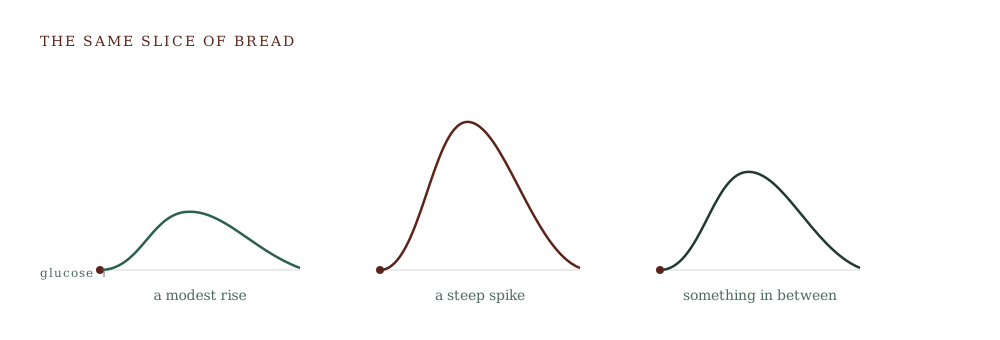
In 2015 a team at the Weizmann Institute, led by Eran Segal and Eran Elinav, put continuous glucose monitors on hundreds of people and tracked how their blood sugar actually responded to identical, standardised meals. The finding, published in Cell, was that the responses varied enormously from person to person. The same bread that produced a modest glucose rise in one participant produced a steep one in another. The same is true across foods that any single diagram must treat identically. A pyramid — old or new, captured or clean — can only ever issue one instruction to everyone looking at it. But the bodies looking at it do not agree with each other about what that food does once it is eaten. This is not a flaw in a particular pyramid that a better pyramid would fix. It is a limit of the entire format. A single national diagram, however honestly drawn, is still wrong for a large fraction of the individuals following it, because the one thing it structurally cannot encode is the individual.
None of this is a distant American quarrel. The pyramid was a template the world copied. The reader in Kuala Lumpur grew up with a food pyramid of their own, rice and noodles and bread across its base, built on the same logic and inheriting the same limitation. The particular diagram on the poster in your school canteen was local. The idea that one diagram could answer the question for everyone in the country was imported wholesale, and it travels with the same defect wherever it goes.
What a guideline is for — and what it is not
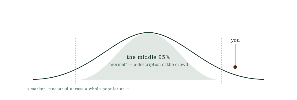
A national dietary guideline is a public-health instrument, and at the scale it is built for it can be a reasonable one. “Eat more vegetables, cut added sugar, move more” is defensible advice to give a whole population at once, and if the average diet shifted in that direction the average result would probably improve. The guideline is not worthless. The error is not that such documents exist. The error is a category mistake: treating a population average as a personal prescription. It is the same mistake I have written about in the context of laboratory reference ranges — the range that describes the middle of a population is a description of a crowd, not a target for the person standing in front of me. A food pyramid is a reference range for a nation’s plate. It can be a useful description of a sensible direction of travel for the crowd, and a poor instruction for you specifically, at the same time, without contradiction. Holding both of those in view is the whole discipline.
What would change my mind
An argument that no observation could disturb is not an argument; it is a belief wearing an argument’s clothes. So it is worth naming what would move me off the two claims this essay rests on.
The first claim is that a national food diagram is a political instrument as much as a scientific one. If a country established a guideline-setting process genuinely insulated from the industries it affects — no seat at the drafting table for the sellers of the foods being ranked — and the resulting diagram proved stable across changes of government rather than inverting when the administration changed, that claim would weaken considerably. Guidelines should of course update as evidence accumulates, and some updates are exactly that. What is telling here is not that the diagram changed, but that it inverted in step with a change of administration rather than in step with any new body of evidence. A finding that is really just a finding does not flip upside down the month a new party takes office.
The second claim is that no single diagram can serve the individual, because metabolic responses to the same food differ too much between people. This one is empirical and therefore genuinely falsifiable. If the personalised-response research failed to replicate at scale — if larger and more diverse studies found that the person-to-person variation was mostly measurement noise, and that a single well-designed set of rules predicted individual outcomes well across different bodies — then the case for individual assessment over a universal diagram would lose its foundation, and I would have to revise it. To my knowledge the replication has so far gone the other way, toward more individual variation rather than less. But the claim is the kind that can be checked, and it should be.
Neither of these conditions has been met. Until one of them is, the two claims stand.
A closing argument
The food pyramid was never just science, and the inverted pyramid is not just science either. Both are what you get when a real scientific evidence base is passed through a process that also has industries, ideologies and administrations sitting at the table. Knowing that is not a reason for cynicism, and it is certainly not a reason to eat the opposite of whatever the last diagram said. It is a reason to stop expecting a diagram to do a job a diagram cannot do.
Because the honest answer to a captured guideline is not a better guideline. It is not a cleverer pyramid, a truer plate, a corrected list of servings that finally gets it right for everyone. The honest answer is to give up the fantasy that one figure on a poster can prescribe for three hundred and thirty million different metabolisms, or for thirty million, or for the one person in the room. What replaces the diagram is not another diagram. It is assessment — measuring the actual person, watching how their actual physiology responds, and adjusting from there. That is slower, less shareable, and impossible to print on the side of a cereal box. It is also the difference between a public instrument and a clinical one.
I do not treat the patients at my centre with a pyramid, old or new, right way up or upside down. I treat them by measuring how their own physiology actually responds — the glucose curve, the labs, the markers that move when one thing changes — and adjusting from what those show. The diagram was never going to be able to do that. It was built for a crowd, and you are not a crowd. That is not a failure of this pyramid or that one. It is the reason the whole format was always going to leave the most important question — what should you eat — for someone to answer with you, one person at a time.